
A visual story of the transformation of our La Union beach house project.
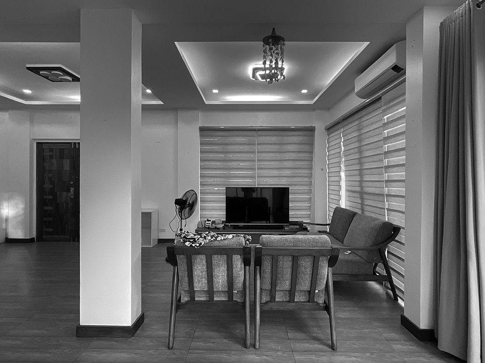
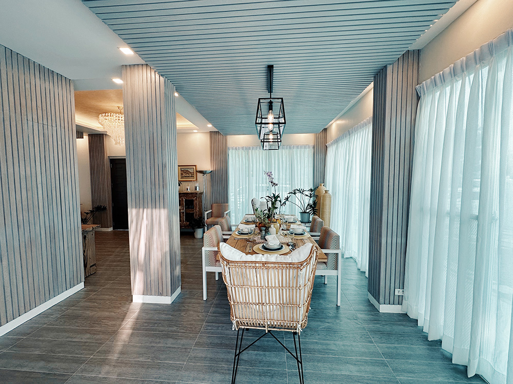
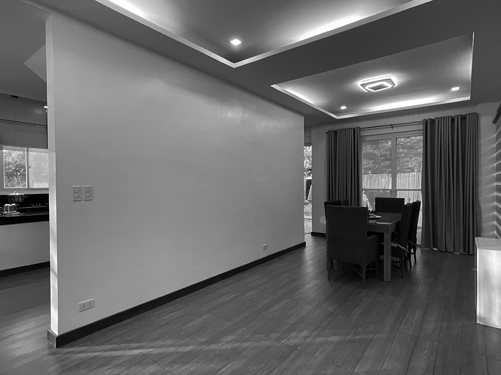
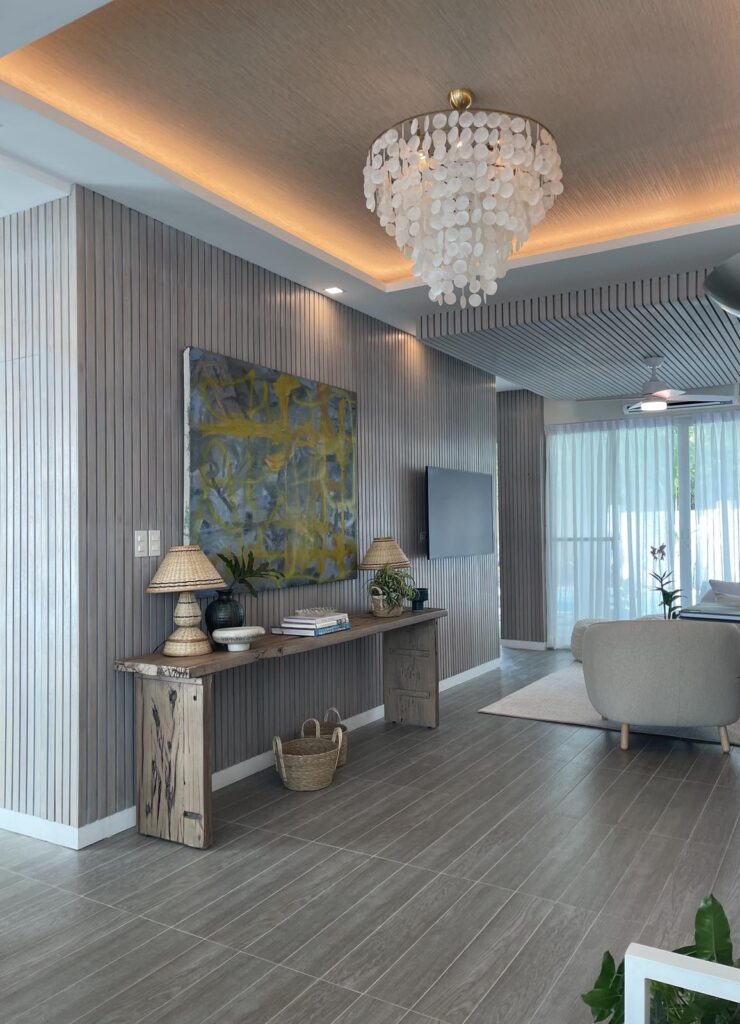
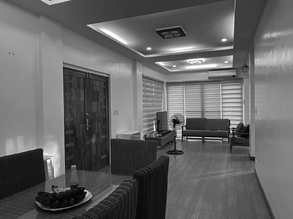
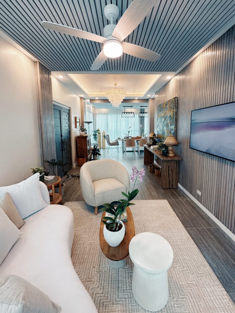
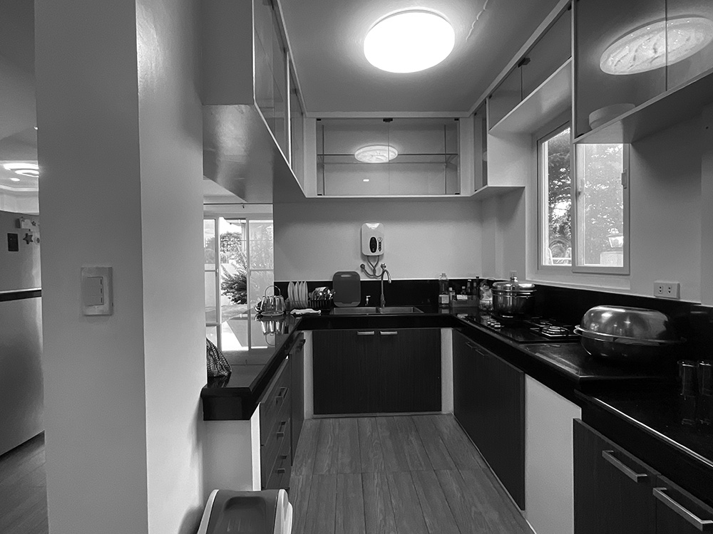
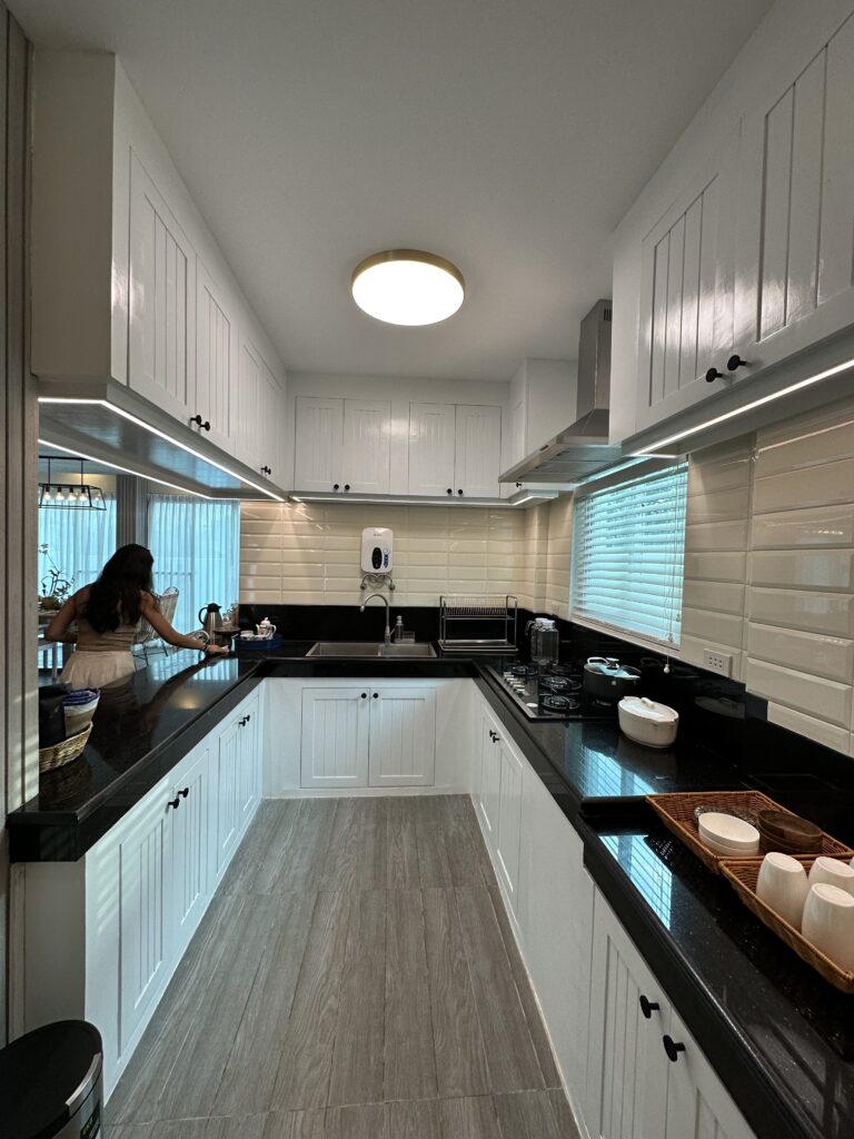
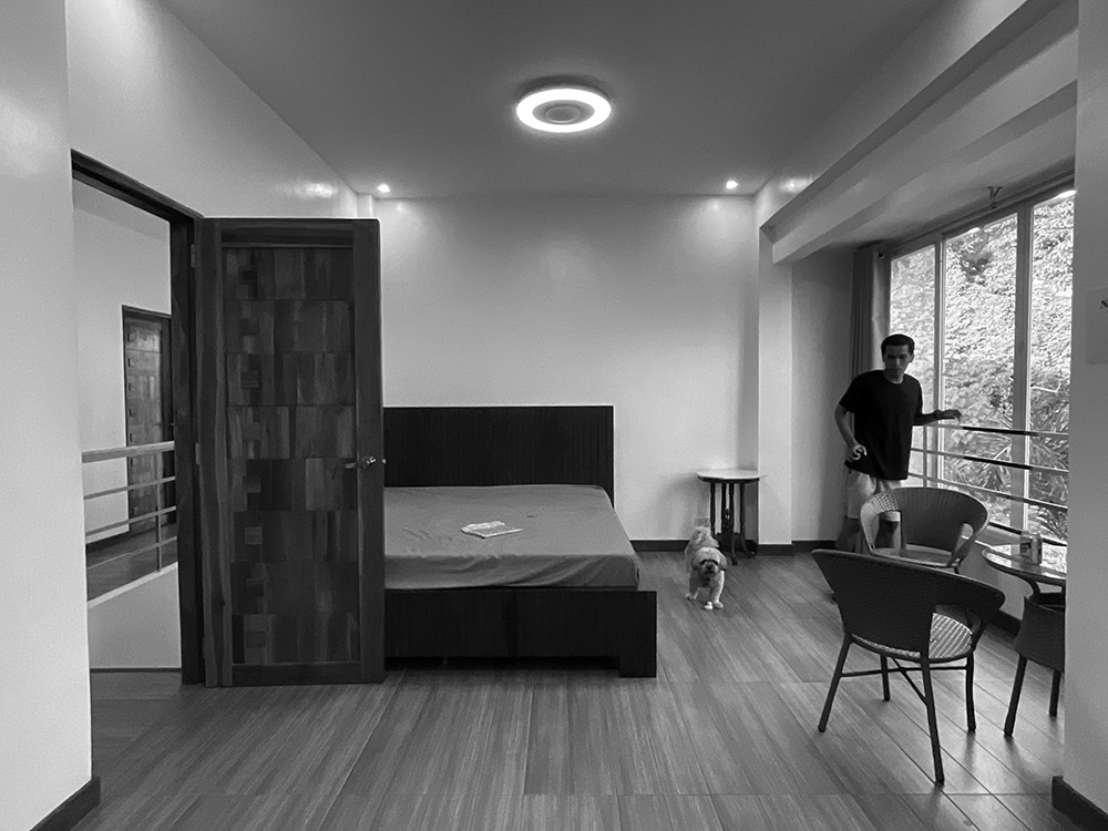
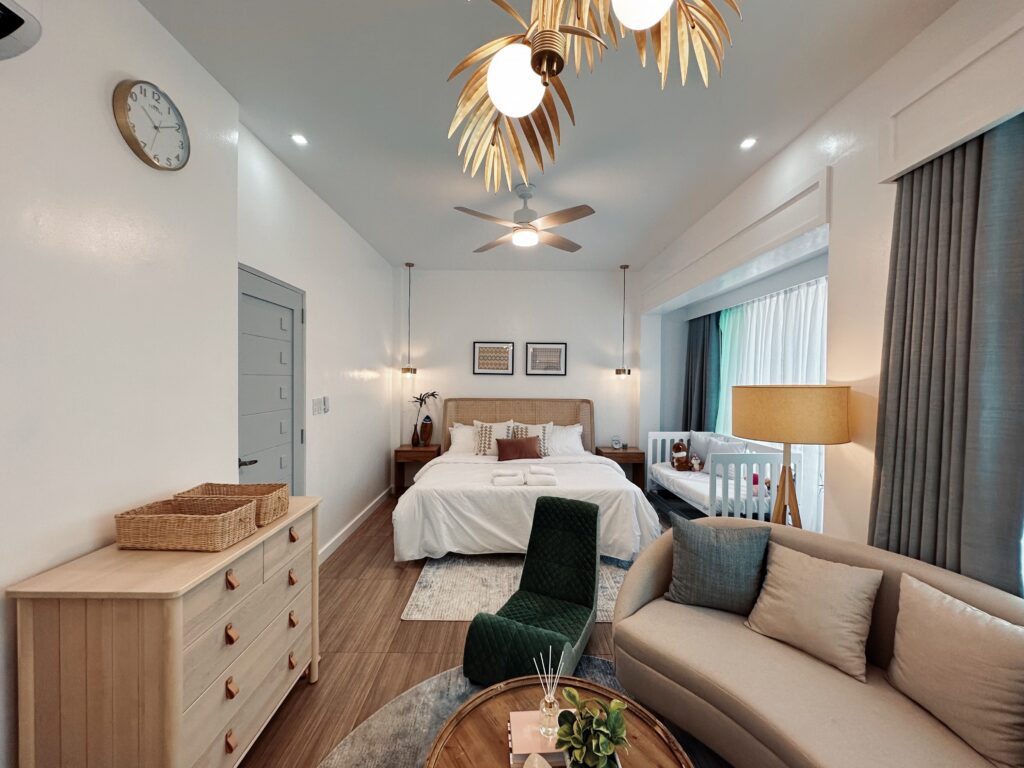
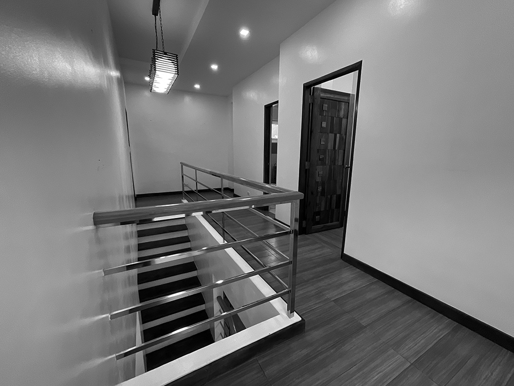
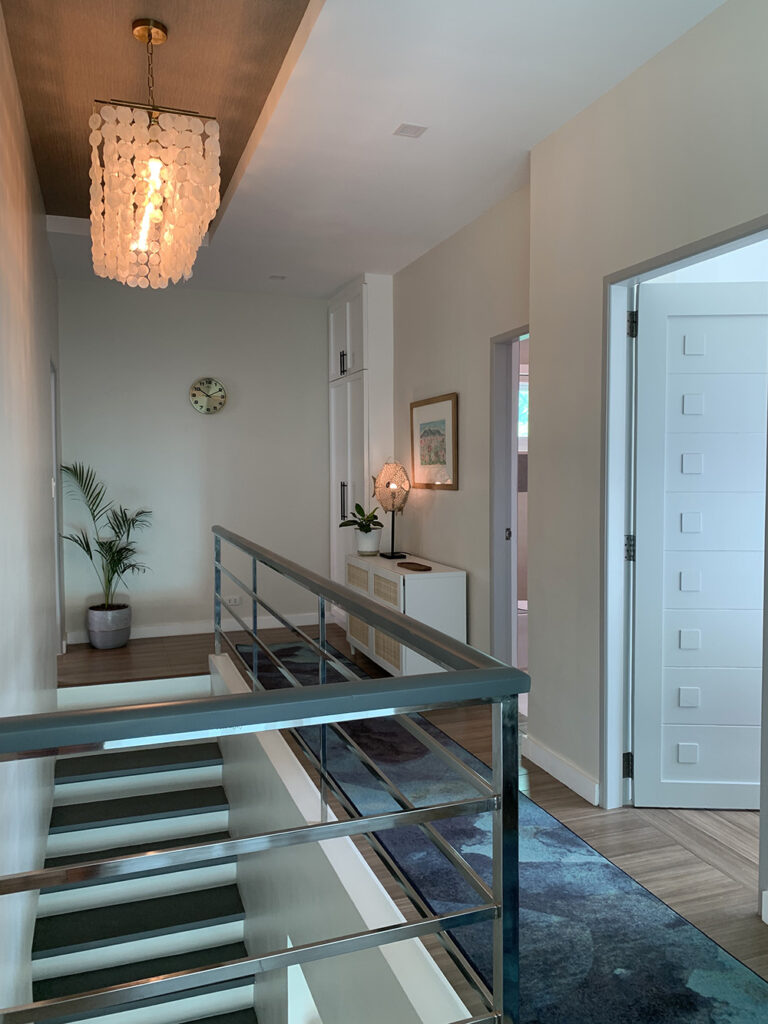
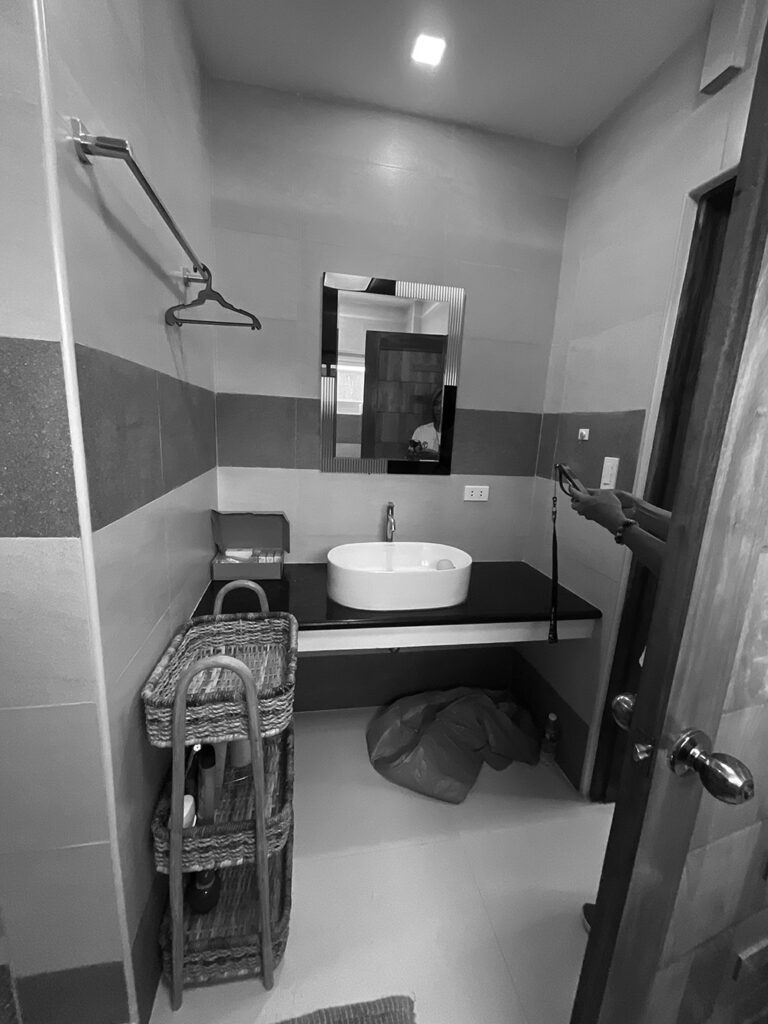
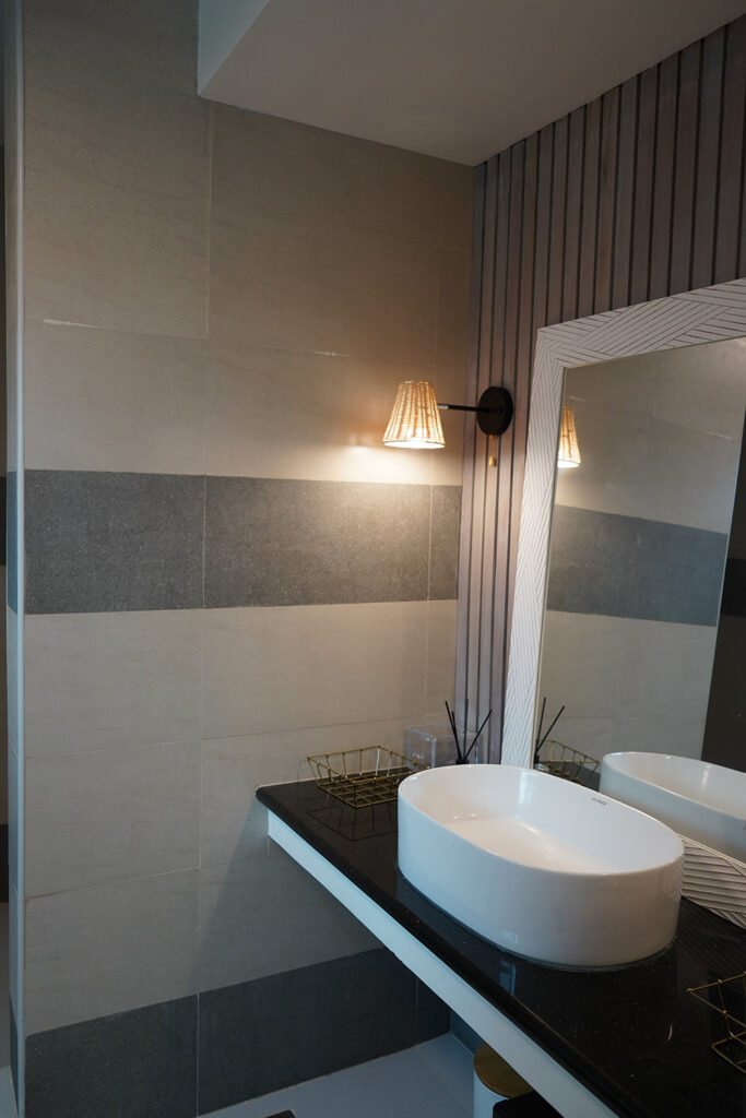
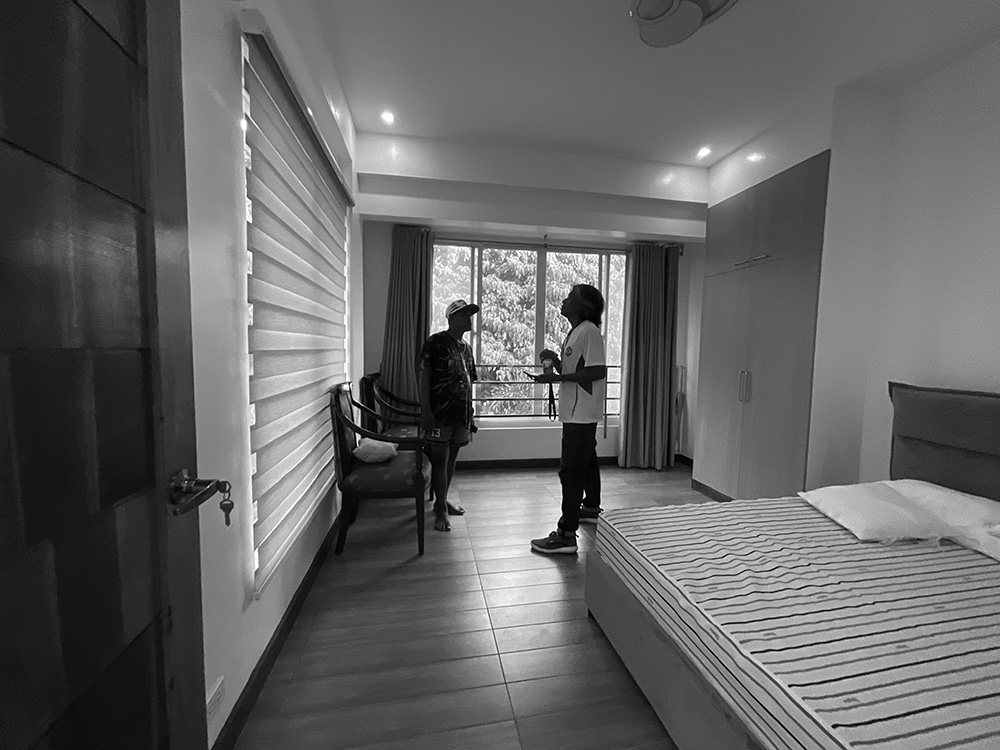
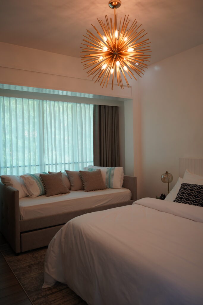
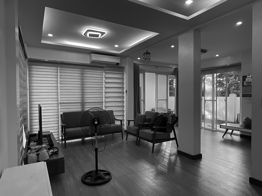
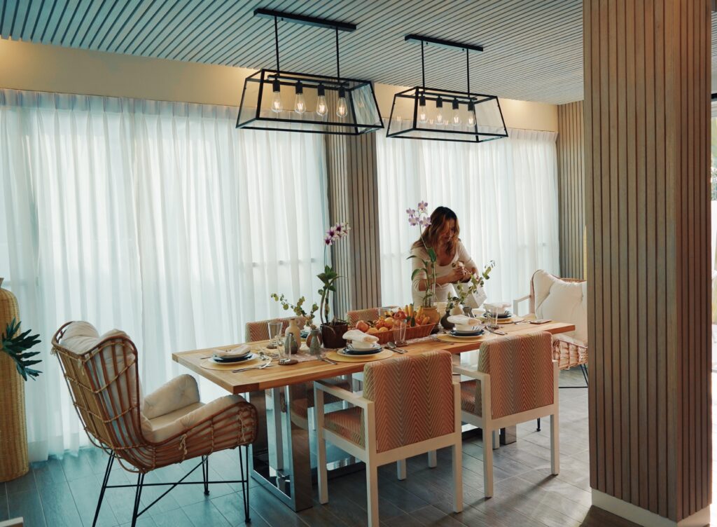
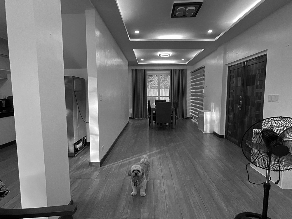
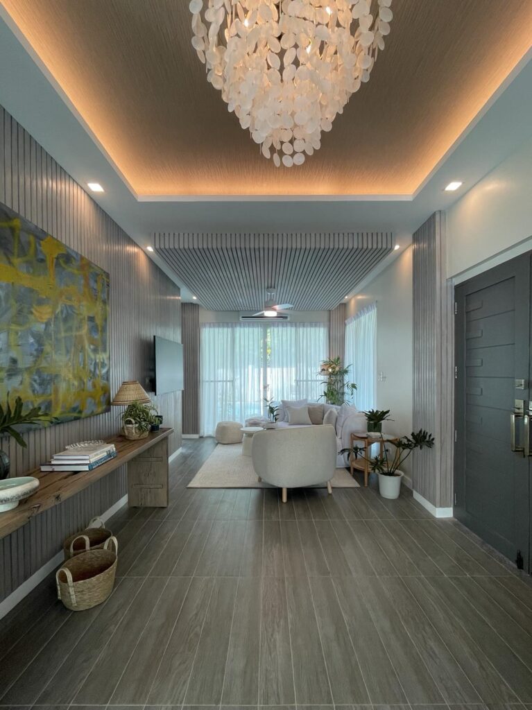
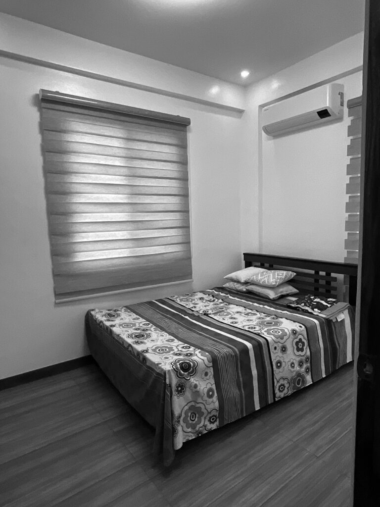
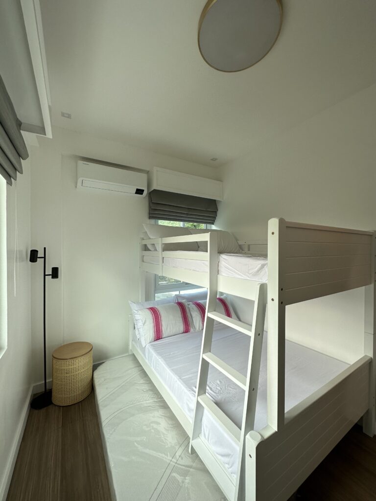
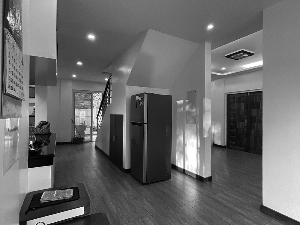
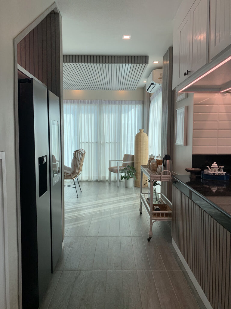
A visual story of the transformation of our beach house project: we had to work with an existing layout that had no clear space delineations, challenging column placements, and dim, mismatched lighting fixtures. To create a harmonious space, we installed ash-gray wood slats that instead drew the eye to a consistent texture that wrapped around the interior of the house, with daylight from simplified window treatments lending tranquility to the space.
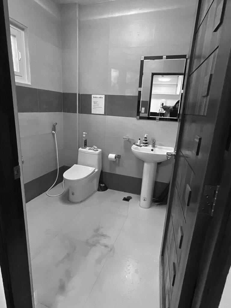
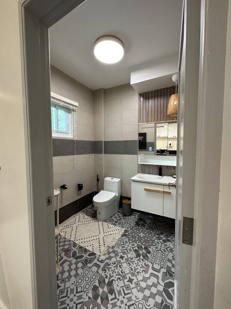
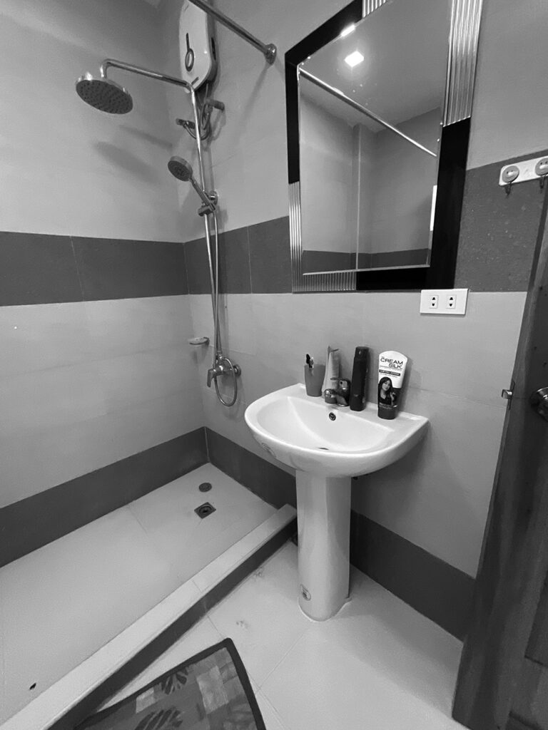
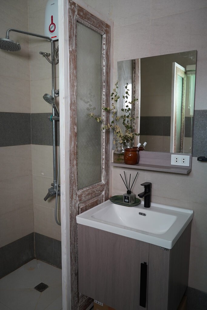
To avoid unnecessary wastage of existing finishes, demolition was minimized through clever use of accent tiles, good lighting, and thoughtfully placed furniture and accessories. A preference to low maintenance surfaces and curvy, comfortable furniture was due to the presence of active toddlers in the family. We worked on this within a tight deadline that proved fulfilling in the end.
Enjoy the photos!
More photos at http://gruposantamaria.ph/la-union-family-home/