A front-liner’s home is transformed into a place of order & inspiration.
Before & After photos of the Art-Lover’s Apartment featured in our Residential portfolio. Due to the heavy demands of her schedule, our client (who is a doctor/ anesthesiologist and a medical officer at the Philippine National Police), has lost the chance to fix her apartment and was in need of a place where she could rest and recharge after consecutive long days at work. This was her living room as we found it on the first site visit: 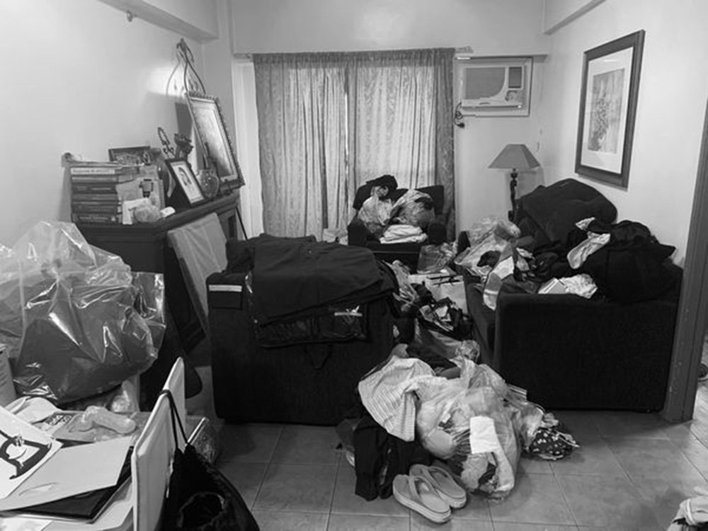 And after renovation:
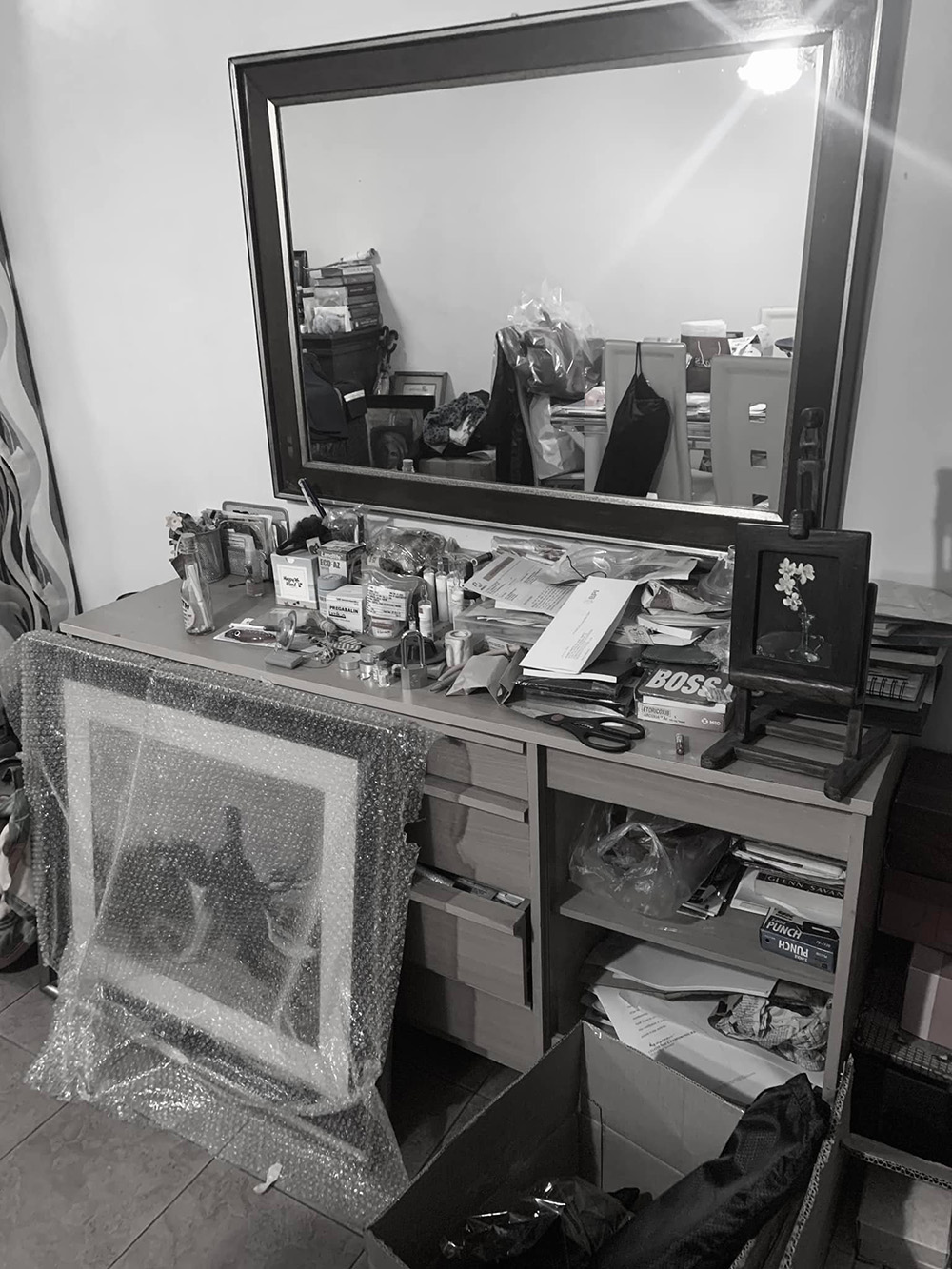
 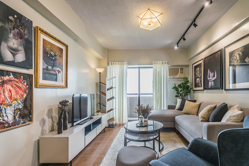 She asked us to reuse whatever pieces we could from her home, and due to the dilapidated state of most of the furniture (she “inherited” it from the previous owner), we could only retain the dining set, the bed, and a lamp or two. The rest really had to go. Fortunately she is a generous soul who gave away most of it to those in need, so she Marie Kondo’d her way into purging 80% of her original clutter!
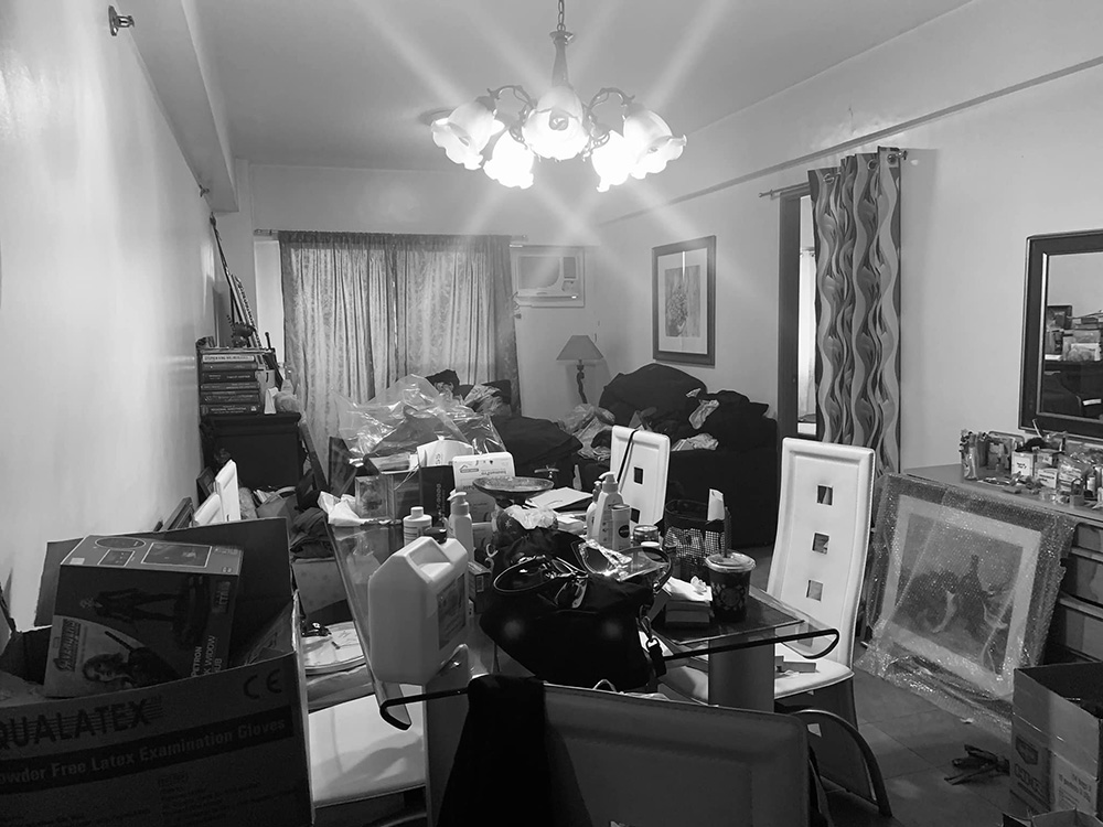
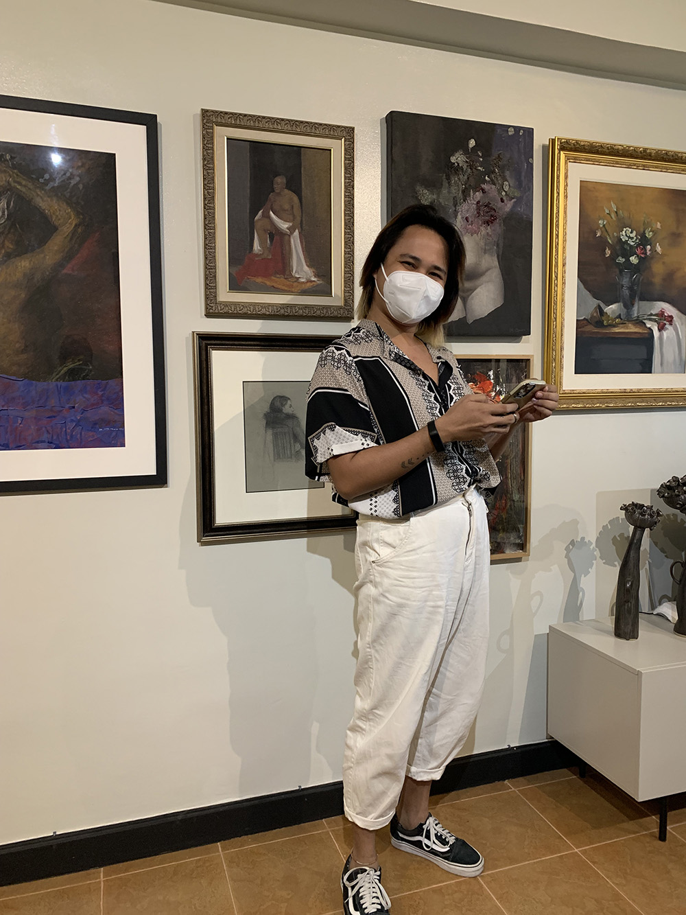
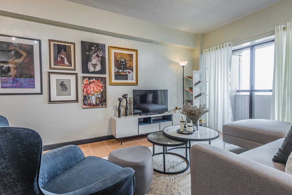
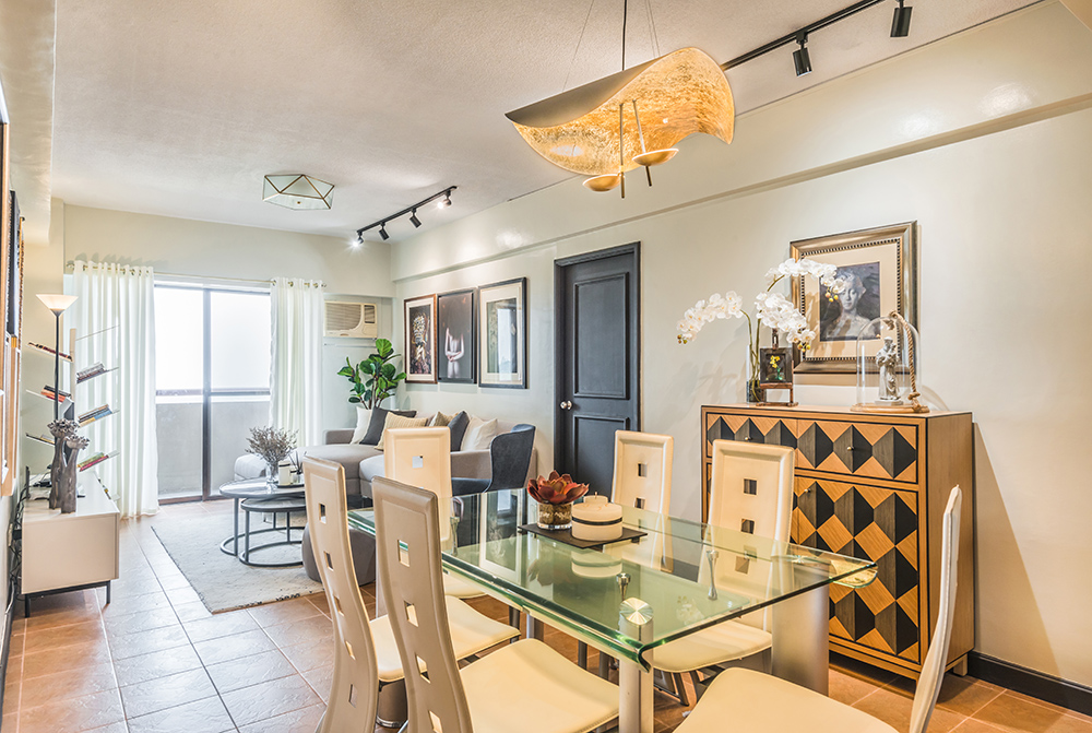 The space was perfect for her growing art collection, lovingly acquired through the years, just begging to be hung and displayed on the walls. If the lighting and furniture layout could be done right, we knew that the different pieces could harmoniously and joyfully co-exist with each other.
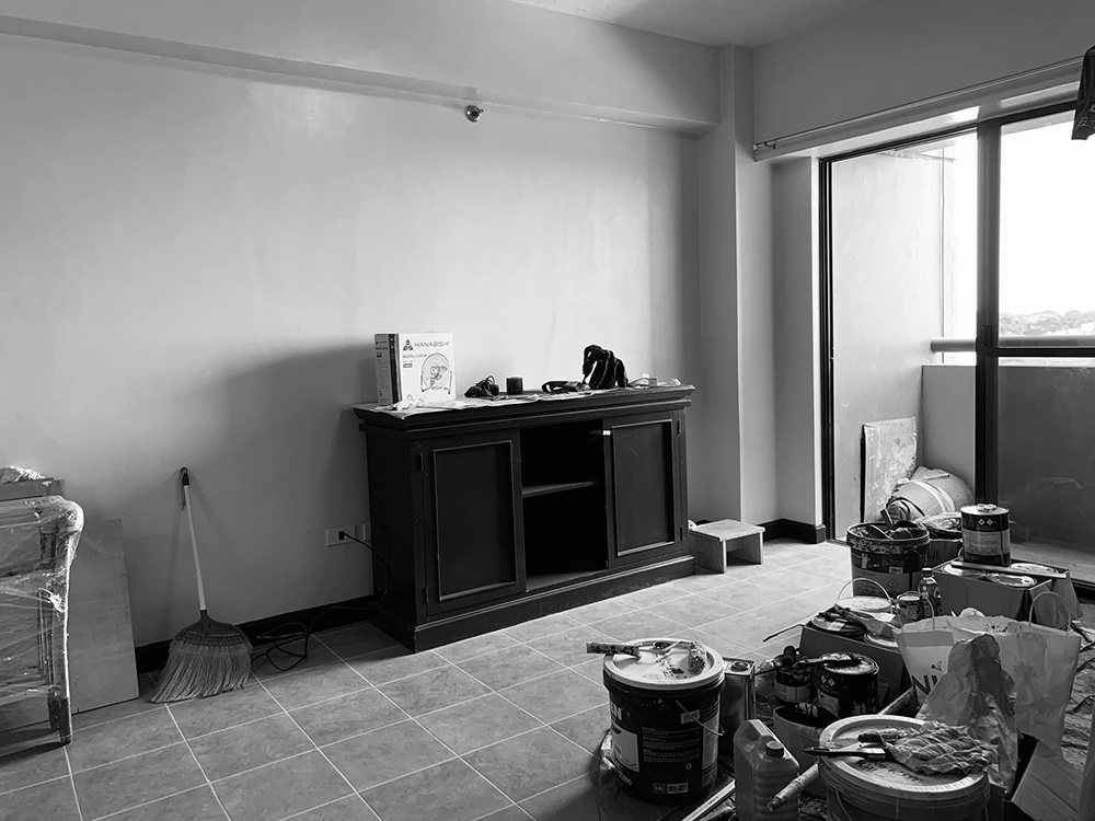
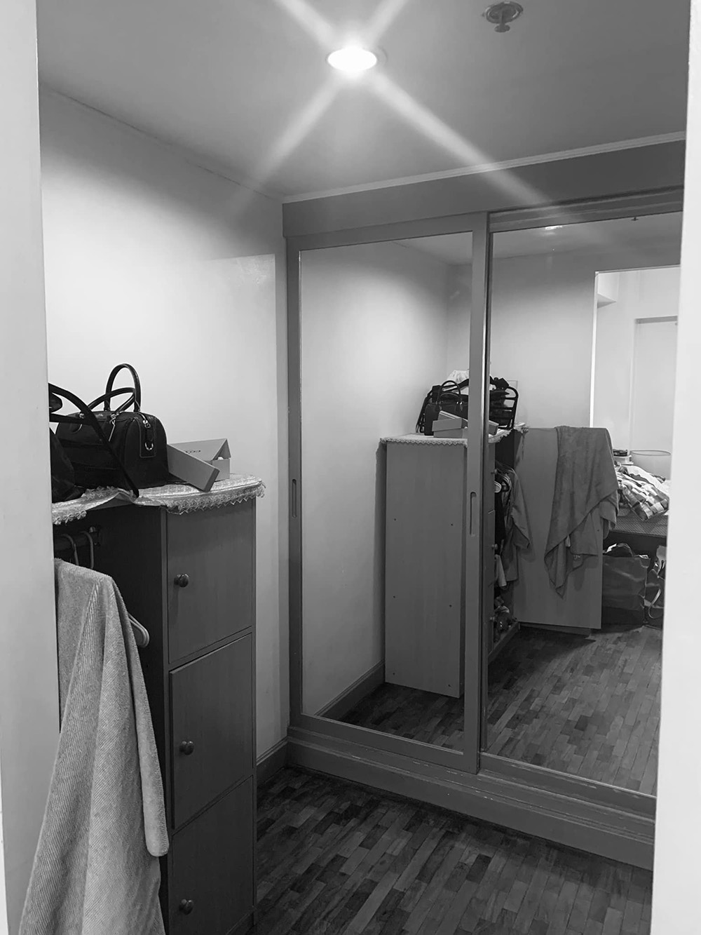
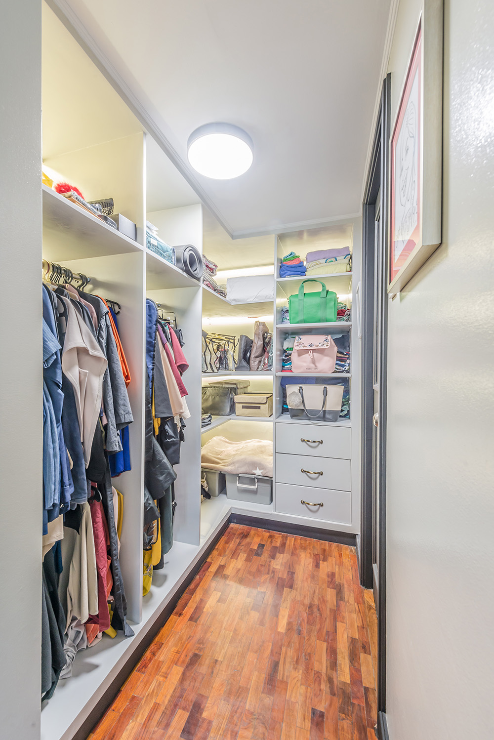
 As usual, the biggest problem we encounter when solving the space problems of old apartments is STORAGE! There is simply not enough of it. Take this closet for instance and how we transformed it into an open, L-Shaped cabinet with built-in lighting. Now who wouldn’t want to tidy up at the sight of that?
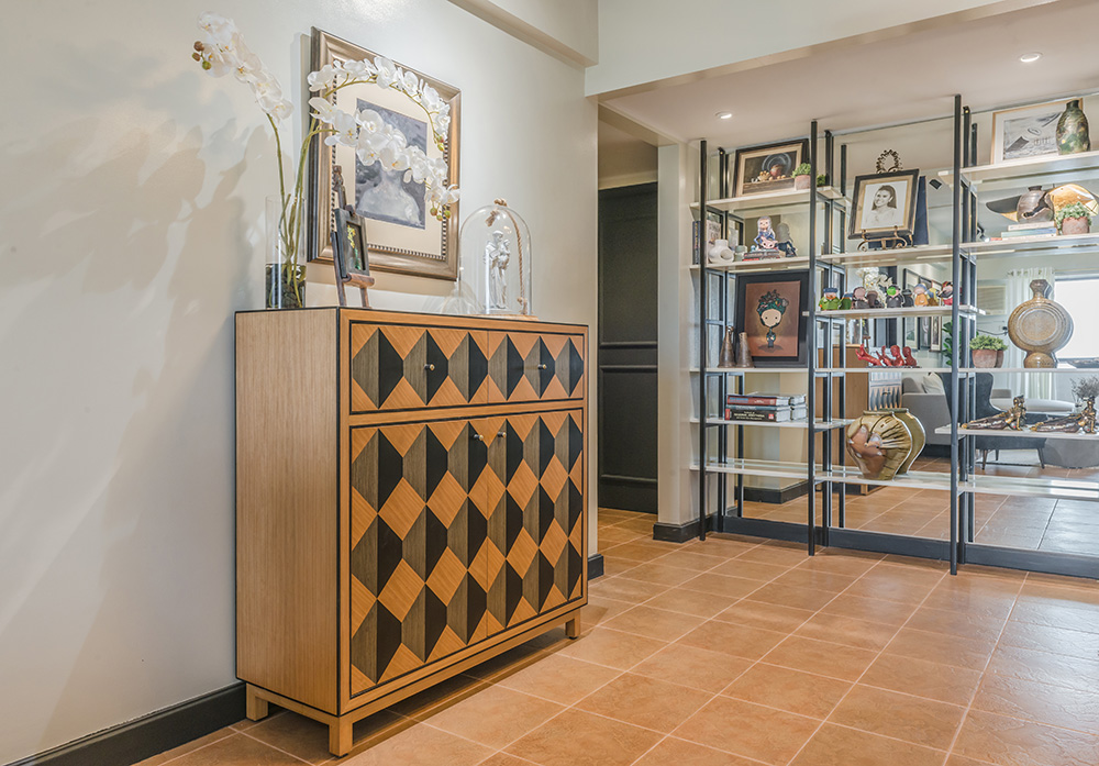
 We also encouraged the owner to invest in quality wood pieces like this one from South Sea Veneer. It would be better to invest in locally made, solid wood pieces than modular, MDF (medium density fiber board) “throwaways” that are yes, lesser in cost, but also poorer in quality.
 We also custom-designed shelves on one wall for her to display her trinkets, photos, and art sculptures that are so dear to her. The full-length mirror lining the back of the shelves does the magic trick as it doubles her space INSTANTLY. It’s not a myth: the mirror is really the interior designer’s best friend.
  The cabinets by the door were transformed into a shoe closet, thus removing the scattered piles of shoes on the floor.
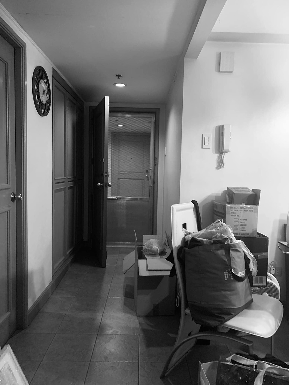
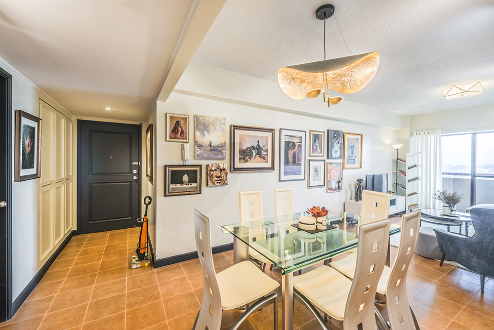 We think that the dining set, which looked a bit dated at first, finally found its true place in this world and fit perfectly with all the other new decor in the house. The floor which worried us at first because of its strong color actually also just seemed like it was all part of the plan (thanks to a neutral and high-contrast color scheme). The “glue” that holds this all together visually is the art collection which is vibrant, rich, and daring, tying everything in place. We dare say, it looks just like an apartment in the chic industrial city of Milan, or at least that was what we were hoping to create for this brave and outstanding human being.
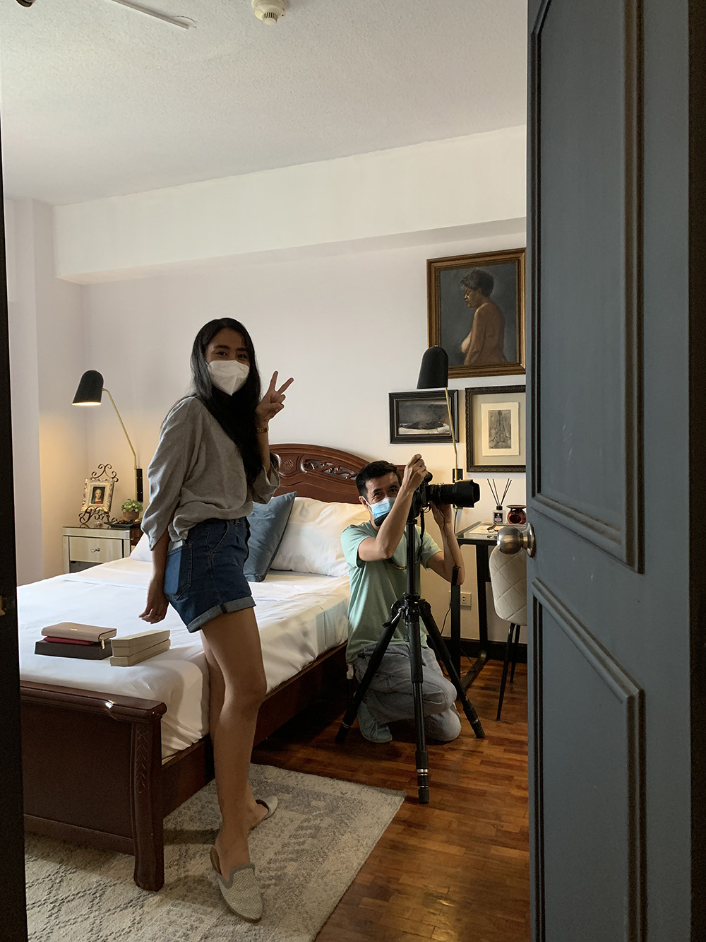
A special thank you to Jessie-R Monsanto and Stella Medrano for working with Grupo Santamaria on this, and to Paul del Rosario for the wonderful photos.– NMS